Disney+ Growth Design
This is the story of how we launched Disney+ and grew it from 0 to 105M subscribers in two years. It was my mission to build "Growth Design" - the team, process, and outcomes - from inception into a 13-person cross-discipline program.
| Role | Responsibilities | Team | Timeline |
|---|---|---|---|
| Senior Director, Product Design | Design Strategy, Hiring & Management, Organizational Design, Stakeholder Management | 7 Product Designers 2 Researchers 4 Design Specialists | Dec 2018 - Dec 2020 |
Note: This is a long and unconventional case study. For quick reference, you can jump to project context, team leadership, design principles, launch UI, expansion UI
Building Disney+ was an adventure. Adventures rarely follow a straight line of progress. You often venture off the beaten path, climb over obstacles, or take one step back and two steps sideways to make progress. I've included just a few of the most interesting UX challenges we faced in the multi-year saga of launching Disney+.

Chapter 1: Basecamp
The Strategy
Understanding Disney's overarching strategy is important for rationalizing design decisions we made later.
Strategic Diagnosis
In 2017 Disney recognized declining revenue from legacy distribution channels: theatrical, cable, DVD, and licensing. That decline, coupled with a dependency on third-parties for customer data, was creating significant headwinds for the business.
At the same time, the business model for The Walt Disney Company is different from their competitors thanks to a diverse set of revenue streams. Establishing a direct relationship with consumers could be used to drive the flywheel for other lines of business.

Strategic Policy
The internally stated goal for Disney+ was to acquire as many subscribers as possible. Profitability was a distant goal on the horizon. We aimed to accomplish this goal with two main tactics:
- Broad Distribution
Make Disney+ available on every device that could stream video, with a purchase flow that was native to those devices. - Wide Availability
Roll out Disney+ globally with a signup experience that complied with cultural, legal, and fiscal norms in each region. - Affordable Pricing
The $5.99 price at launch was far below competitors.
Growth Origin Story
Situation
The Growth Design team began work long before Disney+ launched; before Disney acquired BAMTech to build its streaming services; even before BAMTech existed. Many of the people on the teams involved had already launched & operated dozens of direct-to-consumer services as part of MLB Advanced Media.

Disney acquired BAMTech for its ability to build content businesses. In addition to the technology for streaming high-quality video over the internet, BAMTech had the commerce platform turnstile UX to sell content directly to consumers at scale. That experience gave us a basecamp from which to begin our expedition up Disney+. We already had the infrastructure for many core Growth features:
- Sign-Up
- Subscribe
- Log-In
- Onboarding
- Account Management
- Subscription Management
Challenge
18 months before Disney+ we designed & built Disney's first direct-to-consumer offering in ESPN+. That project deserves its own case study, but I want to call out that much of the foundation for Signup, Login, and Subscription Management was established in the ESPN+ launch. The core of the Growth Design team carried over from that project.


The Mountain of Scope
The complete scope of surface areas for Disney+ Growth can be organized around a few key vectors that intersect. That intersectionality means each feature might have 9 variations of interaction design.
Features x Devices x Payment Terms
| Box Office | Turnstiles | Concession Stand | Closing Credits | Theater Amenities |
|---|---|---|---|---|
| Non-subscriber Browsing | Sign-Up | Onboarding | Cancellations | Mobile Phones & Tablets |
| Landing Pages | Log In | Account Management | Re-subscribes | Web |
| Plan Selection | Activations | Profile Management | Game Consoles | |
| Partnerships & Offers | Account Healing | Subscription Management | Smart TVs | |
| Payment | Ledgers & Billing | TV Set Top Boxes | ||
| Redemption | Upsells (PPV, Premier Access) | |||
| Gifting | ||||
Assembling The Team
Situation & Challenge
At the inception of work on Disney+ the "Growth" design team was 3 designers + 1 UX researcher. We had always worked well with engineers and product owners but not with the degree of specialization or scale that we needed.
Given the scope of features, devices, and countries this team needed to grow.
 Growth Team - January 2019
Solution
Scaling the team to meet the massive scope was another design challenge I tackled with my peer Directors and VP of Product. We aimed for a modular structure, that could scale up, while still providing clear swimlanes, accountability, and autonomy.
After considering functional and matrix designs, we agreed to organize around KPIs that each group of people could chase after. This also roughly correlated to the user journey. We called these "Pods":
| Pod | KPIs |
|---|---|
| Acquisition | Sign Up CTR, Log In CTR |
| Conversion | Accounts Created, Purchases Completed, Upsells to Higher Tiers |
| Expansion | Accounts Created, Purchases Completed, Partnerships |
We then expanded this model to more teams from Data and Marketing (and eventually Operations) and added names. Each of these teams had the autonomy to self-organize around which tactics and processes they used to deliver against the KPIs.

Example Pod
Each pod was able to create their own ways of working, but generally, they found a 2 week cadence of ceremonies to stay in sync, prioritize work, flatten issues, and break out working groups.

Outcomes
Over the 18 months from inception until Launch, I grew the Growth team to 1 Design Manager, 1 Principal Designer, 5 product designers, 2 researchers, and 1 program manager. We also had specialists embedded in the growth team from our Motion Studio, Prototyping, Design Systems, and International UX teams.
I was able to mentor two new designer leaders into positions leading their own teams, with autonomy to deliver against clear KPIs.
 Growth Team in December 2020
Experience Tenets
(aka Principles or Axioms)
The use of tenets, axioms, or principles improves the quality of design decisions on complex projects, so we established them for Disney+ as well. I wish I could say we wrote these with intent, early in the project, but in practice, they emerged organically as we took each step up the mountain.
Writing these with our cross-functional team made these real living ideas that you would hear people say while collaborating.
- First Stream, First
- Disney, Aged Up
- Subscribers, Then Revenue
- Disney Hospitality
1. "First Stream, First"
This was the most important tenet that we aligned with company leadership very quickly. We wanted to make the signup process as effortless as possible – easier than others that guests had used – so we could escort them to their first stream as quickly as possible. We believed having previously known content gave us an advantage we could leverage with less up-front work from the user.
- Remove all unnecessary fields.
- Minimize and humanize legal language.
- Defer all onboarding features.
While this may all sound obvious, it wasn't how many of our competitors were operating in 2018. It was also not how Disney had operated and required significant stakeholder education, reinforced by our 3rd tenet.
2. "Disney... Aged up"
"Aged up" was a phrase that everyone on the design team used on a nearly daily basis. It was a shorthand for explaining that the design needed to be as premium & modern, as it was magical. The dark color palette, modern san-serif type, and restrained graphics exist in service of this tenet.
Disney had already been on a long and steady brand transformation to appeal to all ages, especially adults without kids. It's not just for families. The acquisition of Lucasfilm, StarWars, and Fox are examples of the new content strategy, as is a forthcoming redesign of EPCOT at Walt Disney World.
3. "Subscribers, Then Revenue"
The goal of Disney+ was to deepen our guests' relationship with the stories & characters they love, not to optimize short-term revenue. We accept as an article of faith that this approach maximizes revenue in the long term.
We targeted several business metrics with the design: CVR, LTV, and AARPU. The commitment we made to shareholders for the first two years of operation was a singular KPI:
net subscribers.
Spoiler: this would change six months after the launch.
4. "Disney Hospitality"
- No dark or deceptive patterns.
- Disney goes above and beyond legal requirements.
- The Disney Voice is friendly, direct, and accessible - even for legal contracts.
- Practice unreasonable hospitality.
Chapter 2: Ascent
Landing Page
The biggest challenge for any growth designer is communicating value. Growth Design has two big variables we can influence: motivation and friction.
Growth = Motivation / Friction
We can increase motivation by presenting the value proposition in a way that resonates with people; assuming you understand your users' needs and the product can meet them. We can reduce friction by removing effort for the user, simplifying language, and automating chores. The front page is one of the biggest levers for growth because it is a bigger canvas for communicating value that can increase motivation.
The homepage evolved from early 2018 until mid-2021 starting as an FPO stimulus for research teams (marketing and UXR), and evolving into an optimized proven product with shared ownership between Marketing and Product. Some changes to call out:
- The tagline shorted as we learned what features and values resonated with consumers. Eventually, awareness reached a point where we didn't need any tagline.
- The artwork grew more complex over time. We always knew that people needed validation of Disney+'s value proposition by seeing the content they'd get, but operationally we needed to evolve to keep the titles fresh and localized.
- The call to action coalesced around the bundle as we learned about its value to consumers, and to the business.


Web and Mobile SIgnup
Situation
Prior to launching Disney+, Disney had a large cohort of user accounts through websites, storefronts, and fan clubs. We estimated it could be 20% of our users in the first year.
The primary objective of Disney+ is to enrich and deepen the bond between guests and the stories & characters they love. Maintaining a direct-to-consumer relationship where we know who the user is and can track their interactions across all of Disney. A single identity system would open up even more magical experiences down the roadmap.
Challenge
The streaming engineering teams wanted to operate a sovereign identity system for Disney+ users rather than using existing Disney identity systems. Their rationale was that SOLID architecture principles were needed so the system could scale to launch demand (spoiler: this decision was vindicated in the first 12 hours after launch).
Maintaining two identity systems could provide a clumsy UX for existing subscribers. It also undermined an important D2C goal of aggregating more information about our users. We made an effort to design an interaction flow that would be seamless regardless of the user type.
We wanted to ensure this segmentation was invisible to users, and that both kinds of users had as few steps to complete signup as possible.
Solution
We settled on a "wizard" signup flow that stepped through information progressively rather than trying to design the smallest signup form possible. The first step of the signup flow would collect an email so that we could parse what kind of account the user had.
Existing accounts would be confirmed with an email confirmation containing a One Time Passcode. Once Confirmed, we could use the existing account to grant entitlements for streaming. Net new emails would create a new account by setting a password.
 Signup for Web
 Signup for Apple Mobile
Purchase Success Screen
We debated whether the success screen was truly necessary. From a functional stand-point it wasn't, and our tenet "First Stream First" suggested that we should remove it. On the other-hand there was a usability argument that any commerce transaction needs to communicate its status to the user. 
Ultimately the debate was settled by... you guessed it ... licensing agreements!
Disney had a substantial content licensing business before launching its own streaming service. Aggregating all the content meant legal clawbacks and buyouts of existing contracts. To regain the rights to stream STAR WARS, Disney was legally mandated to provide an offer to subscribe to STARZ within the purchase flow.
The least awful place for us to advertise another service was at the end of the purchase funnel. We also removed the prompt to setup profiles in service of that "First Stream..." tenet to prevent any distractions.

TV & Connected Devices
Situation and Challenge
Design for TV devices has unique requirements that web and mobile don't have. The input paradigm of focus control is distinct from WIMP or Touch inputs, type and color accessibility is different on TV screens, and the canvas size is fixed.
Relevant to Growth Design, the two big considerations are controller types (D-Pad vs Game Controller) and Payment Method (Direct Billing vs In-App-Purchase).
Playstation 4
Playstation is an example of a platform with a game controller, a power-user base, and direct billing payments.


TVOS
TVOS from Apple (which stands in for Roku and Amazon Fire) is the opposite of the Playstation. It's a D-Pad remote, a casual user base, and requires In-App-Purchases through the app store.
This purchase flow was also the most complex of TV devices due to Apple's reluctance to let us require users to create a Disney+ account to use the service. We launched ESPN+ following Apple's IAP guidelines and learned the hard way how difficult it is to heal subscriptions without an account.
Don't let anyone tell you Apple is easier to use.


Optimizing Signup On TV
Situation
Getting people set up on TV is a big growth lever. Accounts who watch Disney+ on their TV have a 2x higher LTV than just mobile & web users. We needed to ensure sign-up and log-in on the best viewing device was as easy as possible; especially such an important distribution channel.
Also, The Mandalorian in 4k with Dolby Atmos is awesome.
Challenge
Sign-up on TV and connected Device (CD) platforms can be cumbersome on non-keyboard devices or constrained due to regulation requirements (e.g. EU 3DS2). Both factors anecdotally lead to negative user experiences and hurt conversion.
Subscriptions made on the web provide much more favorable unit economics, without tolls paid to OEMs or resellers.
Solution
We created a hybrid QR code / License Plate design that would elegantly shift users to the mobile web instead of signing up directly on TV. We proposed an additional bit of magic by adding progress screens on TV while the user completed each step.


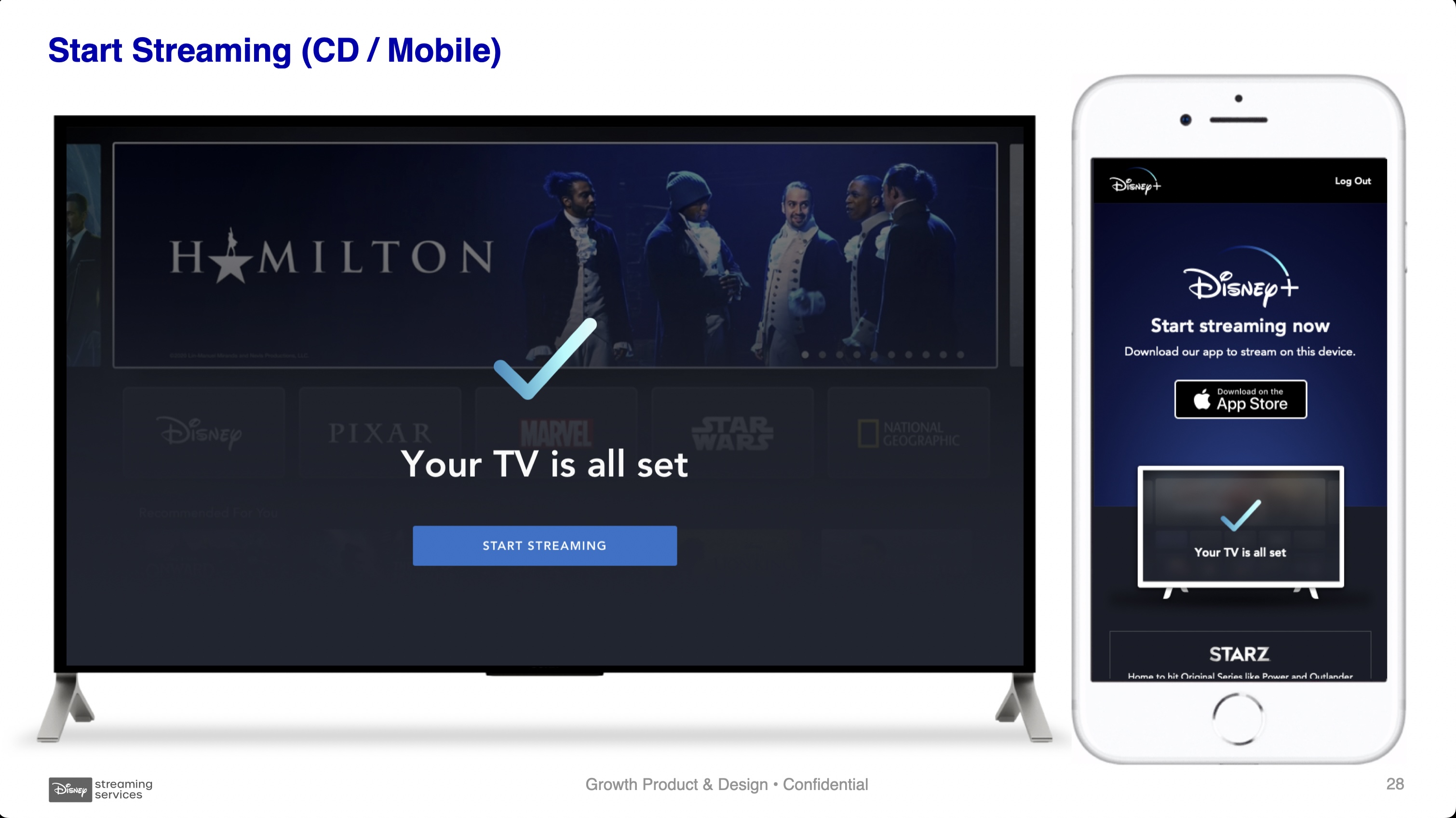
In order to get this solution to market more efficiently the first shipped version would only have the license plate code – no QR code – and we had to remove the progress screens.

Outcomes
We ran usability studies to determine whether QR codes or "license plate" would be usable to our guests. This was before QR codes were normalized in the pandemic. 96% of participants preferred the QR code to the existing solution of entering info manually. 45% of those participants had never used a QR code before but still completed preferred that UX.
In-market we saw a 33% decrease in conversion rate, which was alarming. Fortunately that was offset by a 200% increase in our Bundle take-rate. The increase in bundle sales boosted LTV & AARPU making this new design a solid win for users and the business.
Expanded Distribtion
Situation
30% of our subscribers come through resellers. Some global regions will only allow Disney+ to be purchased through local cable providers. There's also an enormous market of late adopters we can target with offers through cable partnerships.
Challenge
We needed to support a seamless purchase and signup through hundreds of local resellers, on thousands of devices, in dozens of countries.

Solution
We designed a scalable framework that could adapt to different billing capabilities or local regulations. We also designed materials for our Partnership team to help onboard resellers and developers.


Chapter 3: Summit
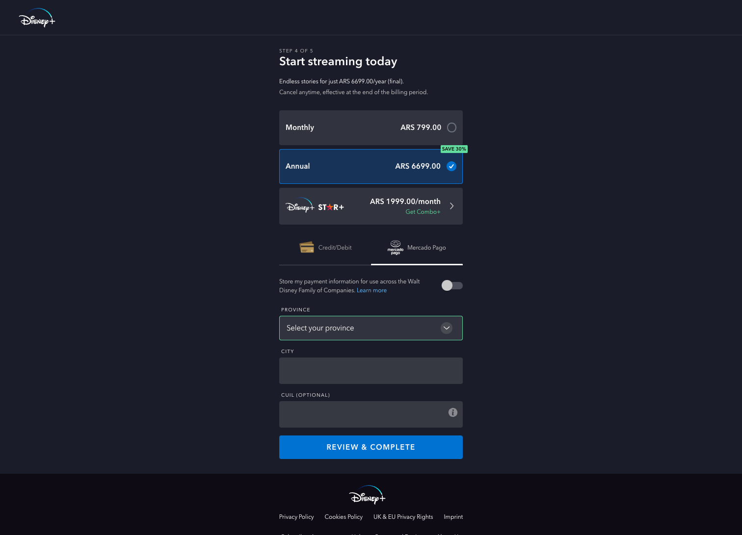
Global expansion
Situation
Disney had global aspirations for Disney+. Disney Streaming established Product and Design teams exclusively focused on the cultural, lingual, and legal translations needed to be truly native in each region - US & Canada (USCA), Europe + Middle East + Africa (EMEA), Asia Pacific (APAC), and Latin America (LATAM).
Challenge
Each region has unique standards for signing a subscription contract, payment methods, and content ratings. The Growth team partnered with our international UX team (IUXD) to learn how these different regions would impact the signup experience. Here were some notable new requirements:
- In Europe, the GDPR privacy regulations passed by the EU, and local restrictions in Germany, France, and the UK required users to be presented with the EULA for signature before subscribing to a service.
- In Latin America, notably Argentina & Chile, there are unique tax laws that require more billing information to be collected.
- In both Europe and Latin America, credit cards are far less common than bank debit cards, or digital wallets like PayPal (namely Pagomercado in LATAM).
Solution
In Europe, we modified the core signup flow to present users with the license agreement, a step to confirm their purchase, and Direct Debit as the default payment option.


Latin America required additional fields for Tax collection in Argentina and Chile
Outcomes
Each new region that we rolled out provided a basis change in growth for Disney+.
Premier Access
Situation
The Covid-19 pandemic shut down movie theaters worldwide.
Challenge
How might we offer guests early access to theatrical releases when theaters are closed?
We had challenges with clarifying the value proposition, streamlining the interaction design, and providing feedback to the buyer.
We also needed to create an elegant interaction flow for existing customers to purchase an additional entitlement, then validate that transaction later in their account.
Solution


Outcomes
This project was a profound learning experience for the company. We learned a lot about our user perceptions of the value of streaming, and deeper insights into the behavior of different market segments.
Subscribers vs Revenue
Situation
In 2021 as Disney+ subscriber numbers climbed and cable carriage fees dropped, we faced some new questions about our goals. Our Finance teams confirmed that our biggest lever for increasing AARPU (or LTV) would be increasing sales of the Disney Bundle with Hulu and ESPN+. The Disney Bundle provided significantly higher user satisfaction and LTV:
| Product | LTV |
|---|---|
| Disney+ Monthly Standalone | 1x |
| Disney+ Annual Standalone | 2x |
| Disney Monthly Bundle | 4x |
Challenge
How might we redesign the signup flow to encourage customers to sign up for the Bundle?
One hypothesis was to showcase the different plan options better to guests. A "plan picker" pattern was familiar to people signing up for streaming services, and it would provide more space to explain the benefits of the Bundle. This would introduce a new step in the purchase flow for users but we believed the tradeoff was worthwhile.
Solution


 A/B flows comparison
Results
The experiment produced good news and bad news.
+0.8% Total CVR
-X.X% AARPU
| Standalone CVR | Standalone Take % | Bundle CVR | Bundle Take % |
|---|---|---|---|
| +X.X% | +XX.0% | +X.X% | -X.X% |
Overall conversion rate increased; supported by much higher conversions on the Disney+ standalone offer. Unfortunately, this came at the expense of Bundle sales that went down, bringing overall revenue down with it.
This test result forced a reckoning within Disney+ Growth teams to decide if we were ready to fully commit to focusing on Revenue Growth over Subscriber Growth. Disney made new commitments to investors for the profitability of Disney+. Our focus formally moved from net subscribers to AARPU.
V2 Workshop
Situation
As I wrote earlier, launching a global streaming service is a climb up a mountain that requires overcoming obstacles. The working group had been heads down working so hard that we lost sight of the larger vision. How might we create an experience that was authentically Disney?
For the past year we had been saying the same words but they meant different things to each of us. Everyone had an idea of what type of users we were dealing with but our conversation often became confusing and convoluted due to a lack of a common language.
We had three things we wanted for the team.
- Develop a shared vision for Disney+ Onboarding
- Explore user journeys; Identify problem areas and opportunities
- Determine priorities as a team
Solution
My direct reports organized a cross-functional summit for everyone working on Growth and Onboarding. This included people from all our cross-functional growth Pods.
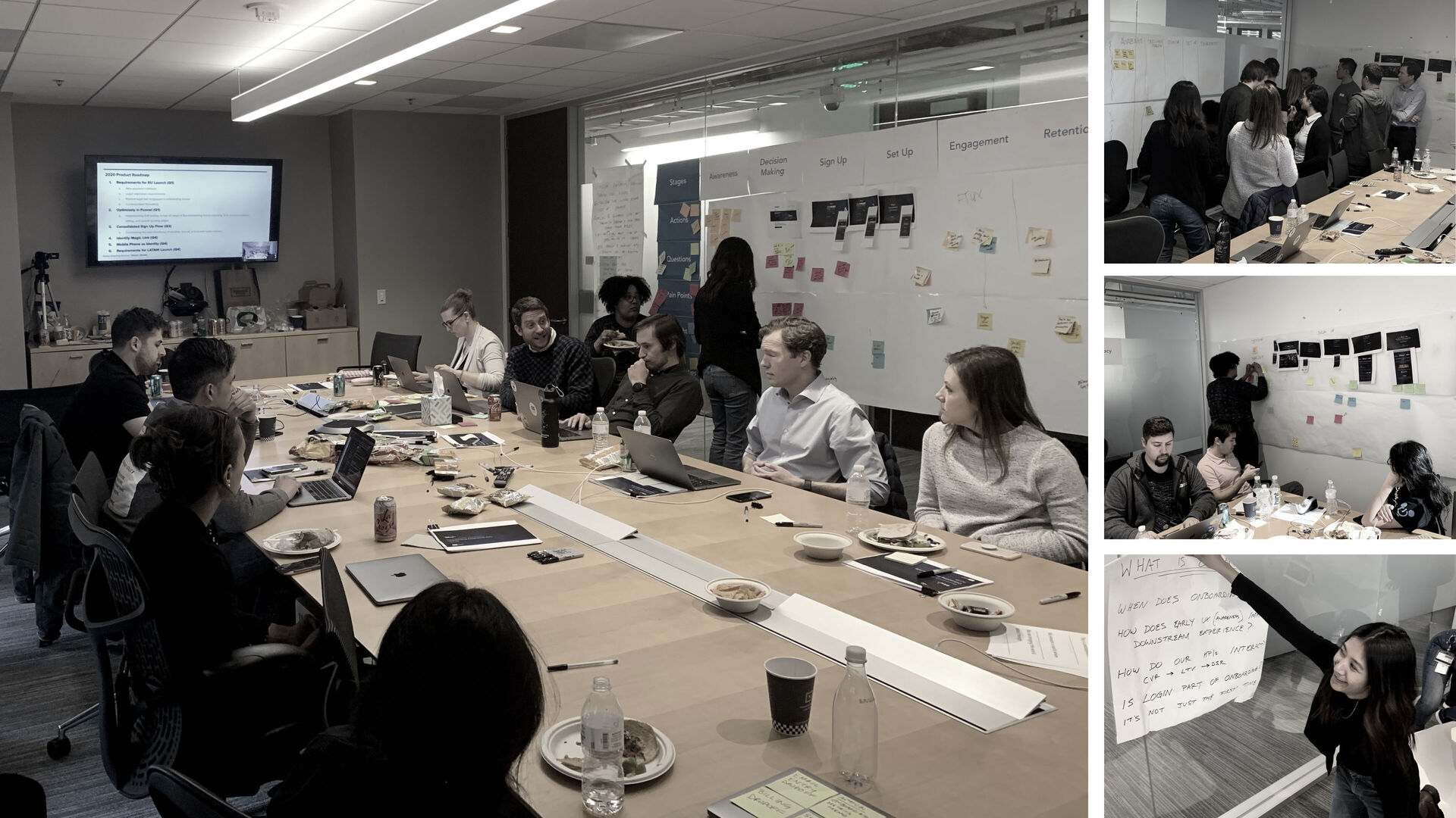

Workshop Outcome
With the trust and credibility we had earned in the launch phase coupled with the time to focus on these questions, we were able to get team alignment relatively quickly.
We also had a list of 6 viable ideas to prototype and test with users.

Chapter 4: Descent
Outcomes
Disney+ became the fastest-growing streaming service ever.
- Net Subscribers
- +103.6 million
- Aug 2019 - Dec 2020
- AARPU
- +$48.36
- Aug 2019 - Dec 2020

I don't believe that the Growth Design was responsible for all that. Disney+ was a desirable product offered at the right time. However, I believe that we did the work necessary – all the user archetypes, devices, payment methods, partnerships, and design systems – to maximize the opportunity.
"We often miss opportunity because it's dressed in overalls and looks like work."
–Thomas Edison
Takeaways
Pride.
Fatigue.
Gratitude.
In mid-2021 I took on a new opportunity within Disney Streaming to lead design for STAR+ our new general entertainment service in Latin America. I handed off the Growth Design team, roadmaps, and partnerships to my colleague.
I'd like to think the foundation we created enabled the continued growth over the next 18 months and beyond.